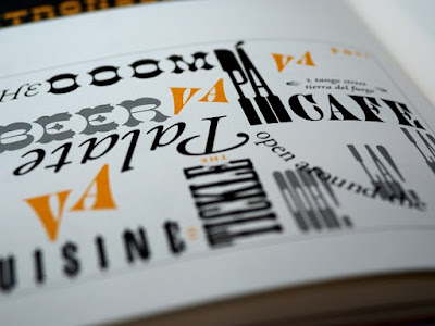
Apart from being an element in other pieces, typography is, itself an art form, much like calligraphy and hand lettering. Like its close cousins, typography also uses the arrangement of text to draw specific emotional responses from readers.
In art, typography can be a foundational element—such as in the case of typographic posters or a supporting component as in illustration art prints and other kinds of art where text isn’t the main focus. Contemporary art and graphic design often features typography as a key ingredient as well, defining the look of everything from corporate logos to album covers.
Unlike many other art forms, however, the value of typography is often tied to functionality, specifically in use of words, letters, and punctuation. While it does explore the artistic possibilities of text, typography remains grounded in the practical aspects of communication, usually emphasising readability and clarity.
But even with its inherent limitations, the dynamism and applications of typography are practically limitless.
Let’s explore some of the ways typography is used to elevate creative works:
Convey Mood and Emotion
Far from simply presenting written ideas, typography can be used to evoke specific moods and emphasise a full range of emotions. The fonts, styles, sizes, spacing, and colours are just some of the typographic choices an artist can make to add a layer of meaning to a given artwork.
For example, using bold typefaces may convey a sense of urgency or strength, while softer, flowing fonts can evoke a more tranquil mood. In any case, the choices an artist makes can help to further shape the meaning of the written message as well as the overall feel of the art piece.
In essence, typography helps text transcend its functional role, giving artists a powerful means of imbuing emotional resonance in a piece. Through deliberate typography choices, artists can inject more layers of emotion into their work, inviting viewers to not only read plain information but also to experience the piece on a more visceral level.
Enhance Composition and Layout
The physical forms of different fonts can be leveraged to give a composition more coherence and aesthetic appeal. Graphic artists often use typography to balance positive and negative space, integrate text seamlessly with imagery, and create a harmonious visual flow—sometimes even intentionally breaking grammatical rules to provide a stronger overall message. These kinds of thoughtful typographic choices can enhance the overall aesthetic appeal and readability of the art.
To facilitate the use of type in this way, artists will often consider each character to be as much of a visual element as illustrations, logos, and other design components. This holistic approach transforms letters, numbers, and punctuation marks into versatile design tools, each with a potential impact on the overall work.
Notably, typography can be used to help establish a visual hierarchy within an artwork. This use of typography is apparent in a wide range of applications, from movie posters to websites. Working together with other visual elements, well-designed text can be used to guide a viewer’s eye along an intended path, allowing for effective communication. Additionally, through the use of varying font sizes, weights, and styles, an artist can ensure that a viewer looks at certain pieces of information before anything else, thus allowing the entire piece to provide a structured experience.
Provides Cultural, Symbolic, and Historical Context
Typography often reflects different cultural and historical zeitgeists. Even without studying typography or graphic design, many laypeople will tend to associate certain font choices and layouts with certain time periods or cultural movements. By consciously incorporating specific fonts within a given context, artists can anchor their work in a particular era or make statements about contemporary design.
Related to the previous point, the cultural contexts underpinning certain typefaces can even be used to strengthen a piece’s overall thematic composition. For instance, using a blackletter typeface like Fraktur can elevate a piece that is intended to appear pre-modern or Germanic in a way that other widely used fonts like Impact or Times New Roman simply couldn’t.
Lastly, typography can be used as a symbolic element in art, adding layers of meaning to a piece’s message. Letterforms themselves can be manipulated or combined to create visual symbols, logos, or abstract representations. Artists may play with the literal and visual aspects of letters to convey messages that go beyond the literal interpretation of the words.
From Printing Press to Pixels
Typography is not a new art form by any means. Indeed, artists have been consciously using type design to elevate the meaning of both the written word and visual arts for almost as far back as the printing press. In the present day, current generations of artists continue to push against the perceived boundaries of typography to further expand our understanding of its capabilities and, consequently, our collective abilities to express meaning.
As technology continues to advance and cultural landscapes evolve, the art of typography remains a dynamic force, honouring its historical roots while continuously branching out into uncharted territories. Whichever way our communication norms change, we’ll doubtlessly see typography’s application in art change with it.


No comments:
Post a Comment
I love reading your comments!